Elections got announced few days back, yet will remain as The News on every channel for the next two months. An event like that will allow media to generate more news everyday – opinion polls, voter surveys, panel discussions just to create derivative content and milk every event to its fullest.
In our context, the primary event of interest is quarterly results, which provides us with a glance into the performance of our companies. So the problem we are trying to help resolve with this blog is – Are we making the most out of the information the results season provides us? To help process this, we had prepared the quarterly results screen.
Based on user feedback, we have improved the screen now. In this iteration of the screen we have improved it broadly on two counts:
- Increased the data fields in the screen – included EBITDA growth, CMP/M.Cap, More valuation parameters and target price set by users. We also added a row on average of the universe selected.
- Enhanced UX – User defined color coding of key fields as Green and Red to highlight and identify strong and weak performers across large company sets.
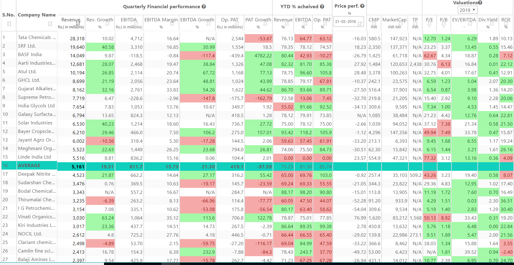
I have been positive on the chemicals sector in India over the past year or so. So I checked the screen below – and interestingly companies which beat our forecasts (see YTD% achieved, green cells v/s red cells) actually saw better share price performance than others.
To get to quarterly screen – Click on Screens from the left slider, else use this link https://districtd.co/user/quarterly-screening once you have logged in.
Related Blogs
THE TECHIE FUND MANAGER!
Indian equity markets have grown at a rapid pace o....
Udit Garg
12/03/2017 12:00 AM

It Is The Commodities We Need To Worry About
I have been thinking a lot about this – if as an e....
Udit Garg
26/10/2018 12:00 AM